Henry+Horne
Brand, Art Direction, and Web Design
Since 1957, Henry+Horne has been guiding clients on the road to financial growth as one of Arizona's largest accounting firms. Now, with 3 locations and 60 years in business, much has changed. While Art Director at Resound, I led and executed the redesign of Henry+Horne's logo and identity system, as well as the Henry+Horne website.
When my engagement with Henry+Horne began, the Marketing Director's goal was to build a brand that would sweep the Association for Accounting Marketing Achievement Awards. At the 2017 ceremony, Henry+Horne took home four awards in categories including Branding and Website.
Redefining 60 Years of Accounting
Henry+Horne found itself in an uncomfortable position. After losing their rank as "Arizona's largest accounting firm", they didn't know who they were. They needed a change, but had no idea what to do. Sound familiar? After researching and collaborating on an in-depth brand audit, I redesigned the firm's logo to echo some of their redefined personality traits:
Relational: Clients are more to Henry+Horne than paperwork and a paycheck. They know how clients take their coffee. They know their kids by name. They're loyal to their clients.
Steady: They're young-at-heart but rich in experience. Weathering almost 60 years of change shows steadiness and adaptability.
Confident: They know what they're talking about and there's no hesitation to address life's toughest financial issues.
“Before, the logo was dated and had functional issues: stretched type, inconsistencies, off-balance layout, and an over-descriptive name and tagline. It didn't stand out in a sea of "professional" accounting firm logos.”
An identity that serves the business and the customer
The new logo:
Is as friendly as their employees. Henry+Horne consistently receives high marks on customer service and has won many workplace awards. Their people-first approach required a friendlier and less traditional look.
Levels-up the company to compete against larger firms, which don't tend to qualify themselves with "LLP" or "CPAs".
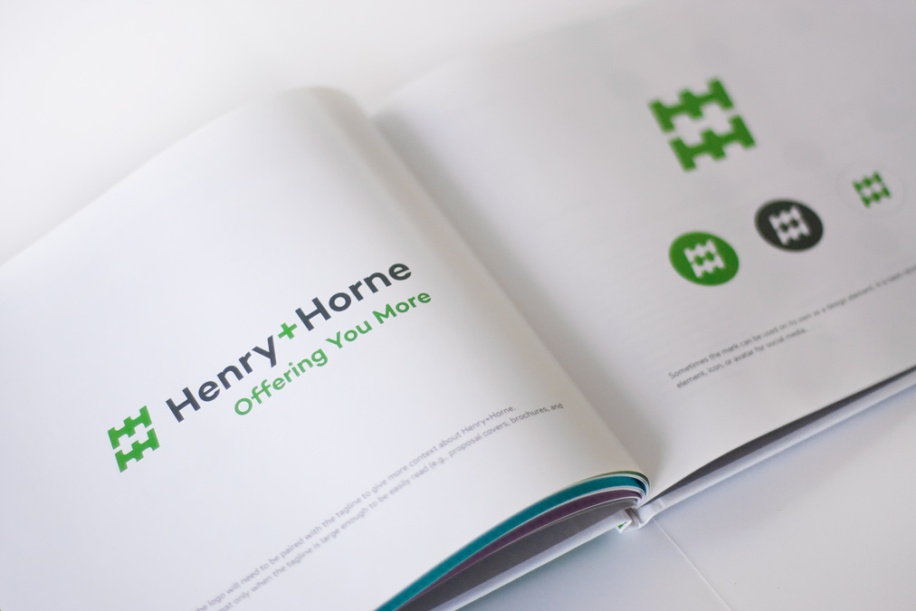
Is flexible. The square logo mark can stand alone and fits well within avatars for their frequently-updated social channels.
Contains nods to their services and values. Through visual testing, we determined that an ampersand was too complicated a shape for the simple typeface; we brought in a plus sign, which gives a nod to the firm's specialty (math) and is a subtle hint that they offer more – more service, growth, positivity, attention, financial health, etc.
Brand Implementation
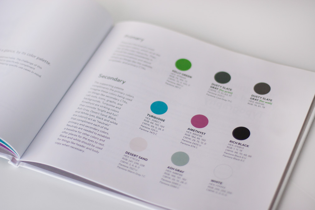
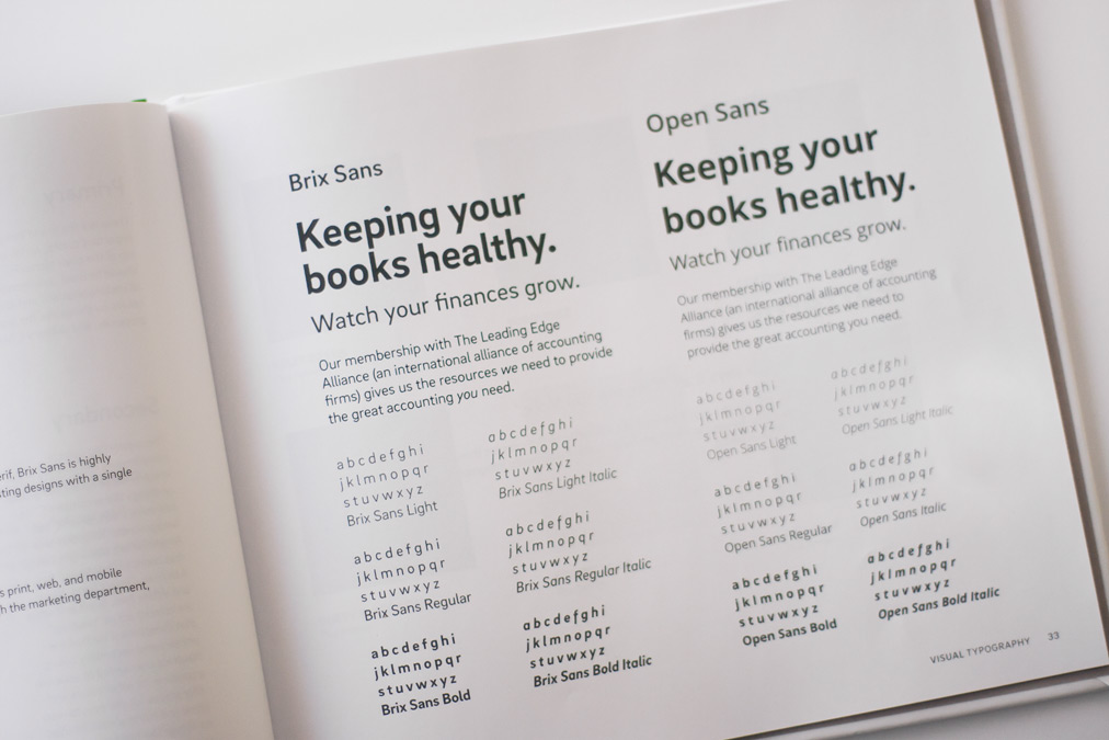
Like any great client, Henry+Horne wanted to take the redesign and make it theirs, so we created a handbook to guide them in building out the new brand. Three months later I visited their team for a "brand check-up" to assess their use of the guide, answer questions, and give them confidence to expand on the guidelines. Because that's exactly what a brand guide is—guidelines, not hard-and-fast rules.
I designed the visual identity and assets, styled typography, and provided art direction for photography, as well as direction on the new naming convention. Further, I collaborated on all conceptual content: values, personality, and brand metaphor.
Trust Your Accountant?
Trust Henry+Horne.
Henry+Horne values people – this includes clients and employees. The firm's employees are esteemed as individuals, and most clients build trusting, loyal relationships with their accountant. The problem? Clients felt more connected to their specific accountant than to the firm overall. We wanted to bridge that gap. All content and imagery was strategized with this in mind.
A brand metaphor tells a new story
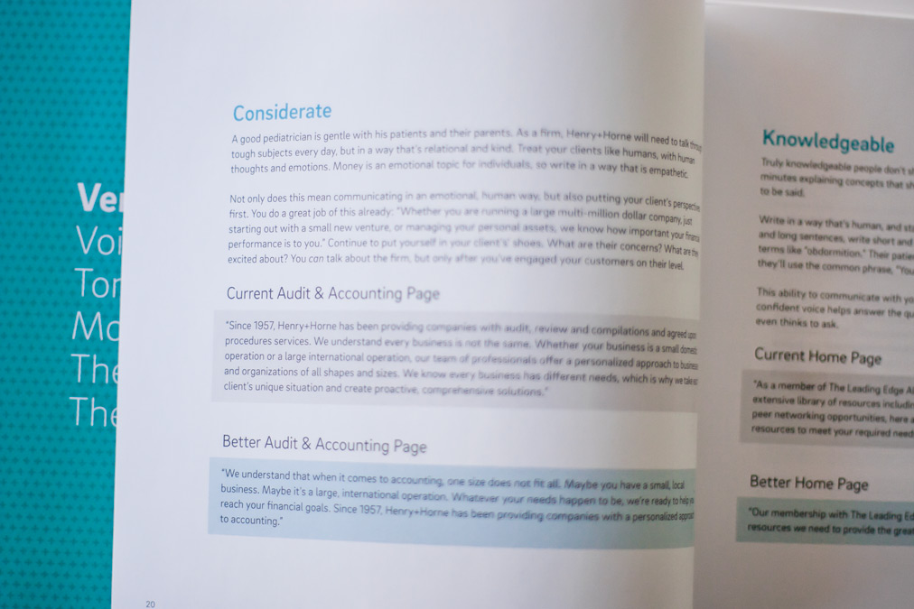
Accountants. What do you think of? Boring bean-counters with calculators? The firm fought against this stereotype but their previous brand wasn't helping—so we wrote them a brand metaphor. Visiting Henry+Horne with your money is the same as visiting your family's pediatrician with your child; you want expert advice and friendly care to help your baby grow. It can sound silly to make up a story, but it guides the client to frame content and design through that lens. "Do people feel toward us the way they'd feel toward that doctor?”
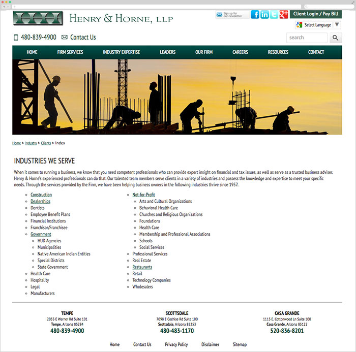
“Before” website: Henry+Horne's website was dated, overwhelming, and difficult to navigate. Every page looked the same, it lacked hierarchy, and calls-to-action were hidden.
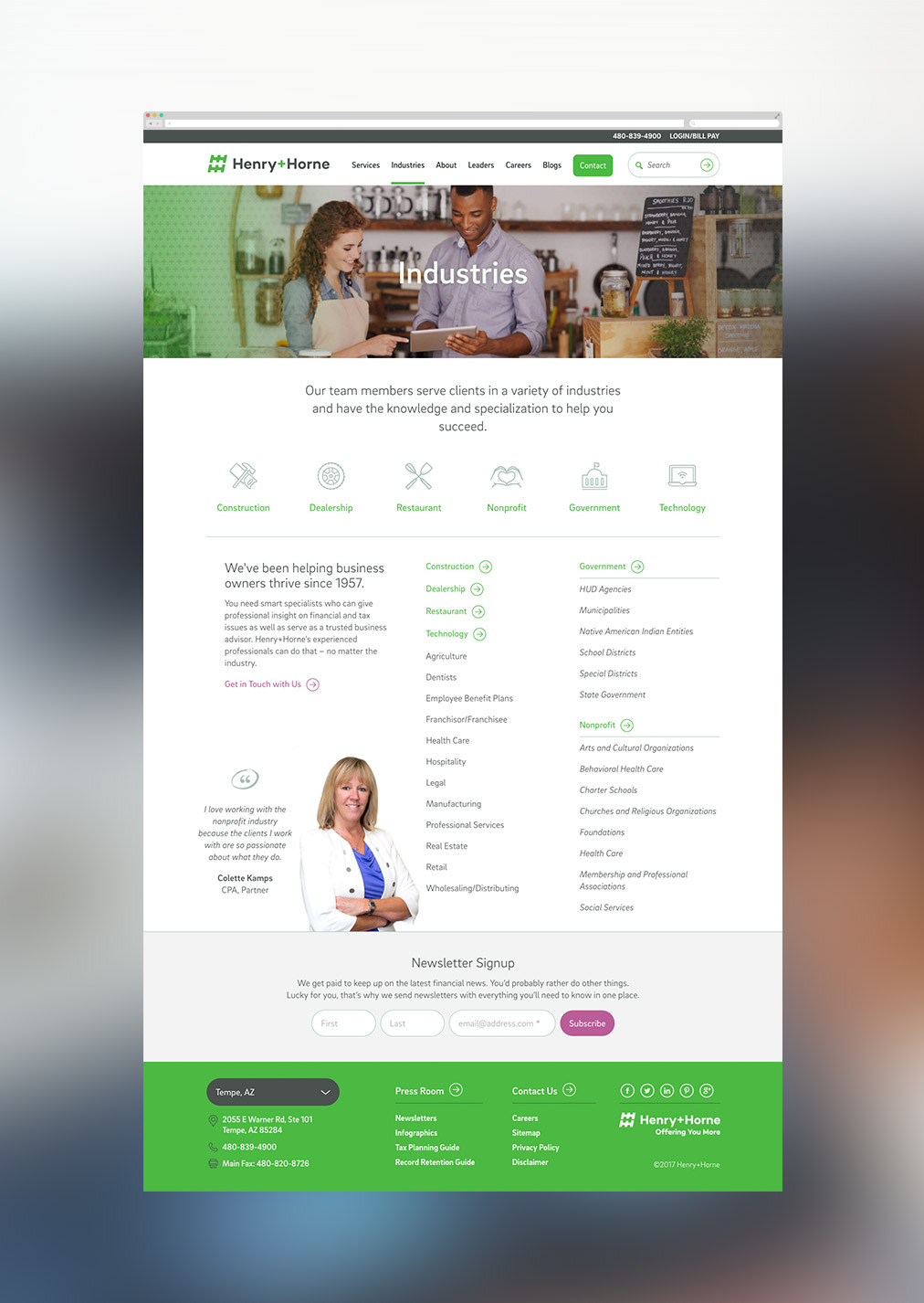
The new website…
Has a clear look and feel. Site content reads consistently and visuals produced for blogs, infographics, resources, and social media look like they go together.
Guides people instead of letting them wander. Navigation is more intuitive and gets people to the correct service or industry they're looking for right away. Now, there's clearer page layout, hierarchy, and calls-to-action.
Features authentic imagery that reflects Henry+Horne's personality and values. I art directed Henry+Horne's marketing team in shooting photos of their teams and gathering more realistic (and less hammy) photos to represent their clients and service industries. Photography styling played a big role in the brand redesign, and I made sure it came across on the new website.
Before: The "Industries" page didn't highlight their main industry areas, a call-to-action, or why having an industry-specific CPA matters.
Providing a seamless responsive experience
Redesigned with small screens in mind, the site provides a recognizable experience regardless of device. Previously, Henry+Horne's mobile site was barely usable and only offered location information. Now, you can have it all – on your phone.
Good design can keep site visitors from getting fatigued and will better hold their interest. I redesigned the blogs' landing page and added a featured post section where the firm can highlight important posts, services, or promotions. Now, the blogs have more compelling visuals and it's easier to find the blog or specific tagged content relevant to the reader.
Great content isn't great on its own—it needs to be readable.
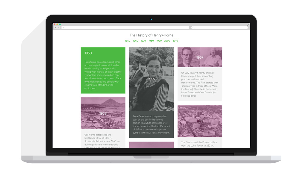
Visualizing 60 years to build trust with prospective clients
To demonstrate the firm's steadiness and adaptability, I conceptualized a visual timeline for their firm's history that weaves in inspiring moments from American history. Clients can see how Henry+Horne has weathered change and will gain a sense of trust in their longstanding business.
