Resound
Art Direction, Brand, and Print Design
Resound is a branding and experience design agency in Tempe, Arizona—specializing in honest identities, engaging online/real-life experiences, and strategic campaigns for medium-to-large businesses. As the Art Director, my focus was to not just create compelling design for clients, but to also realign Resound's branding to clarify an authentic company message to reach long-term goals:
Reposition Resound within the agency landscape by aligning and sharing matured values, voice, and visuals
Acquire larger clients in new service industries, as well as higher-level talent to scale the team
Amplify brand messaging among clients and fans with engaging visuals to bring in new business
Building an 'authentic identity'
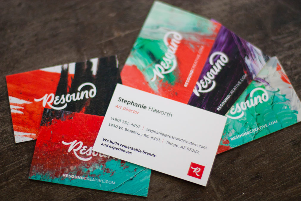
Resound’s new look…
Is well-crafted, and balanced instead of focused on overt sound wave imagery. (It still contains a nod to that metaphor in its form)
Is fresher with a vibrant red, not muddy or heavy
Dropped “Creative” as the qualifier wasn’t necessary
Is authentic. The old logo was an off-the-shelf typeface which is fine for many brands, but not for a creative agency.
The new logo was custom hand-lettered under my art direction by Wells Collins.
I sought out a number of talented letterers and was thrilled to work with Wells, who brought many styles to the table. I worked with Resound’s co-founders to dot vote on our favorite logos and elements. We discussed why some things worked and others didn’t and landed on a solid direction.
Image: Wells Collins
Resound also needed motion and sound design for the logo, which was created under my art direction by David Hildreth.
Brand Implementation
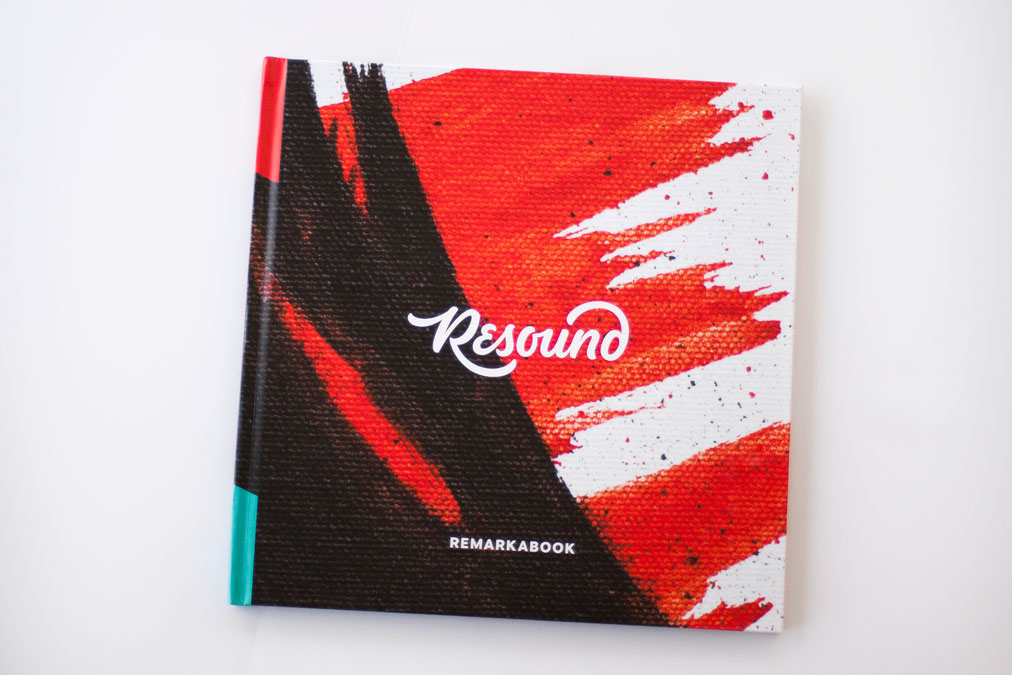
I designed a custom brand guide—the final product of the brand overhaul.
New logotype and monograms
Brighter, approachable, and more expansive color palette
Improved typographic styling and supporting typefaces
Custom-painted textures and a stylized icon set
Revamped conceptual brand metaphor to realign the voice of Resound's messaging
Image: Resound. Reviewing custom textures with local artist Kelsey Jones and in-house Designer Alex Leiphart.
Image: Resound / Alex Leiphart. Shooting textures for asset repository.
The "Resoundism" Project
Resound's culture is supported by "Resoundisms"—mottos that represent company values, brand personality traits, and the candid (sometimes philosophical) voice of the brand.
Launching the Resoundism Project, I art directed Wells Collins on 12 lettering pieces.
In a matter of weeks, Resound gained new beautiful assets for internal projects, the forthcoming website redesign, social media, and promotional items, such as a calendar gift we sent to clients.
Holiday promotion
I conceptualized and art directed a limited edition calendar set given to clients, contractors, and friends. Each month features one an inspiring "Resoundism”.
Swag Bag for PHX Design Week: “10 Ways to Use These Postcards”
I conceptualized and art directed a swag bag promotion for the Method + Madness 2016 conference. Ideas include "Break up with your summer camp girlfriend" and "Start the world's smallest bonfire".
